Friday, February 26, 2016

You Can't Reference This!

First off I want to point out that we are in a post modern art era, this means as far as the world of art critics are concerned there is nothing new under the sun. Now, I have a "problem" in the fact that I can look at something and draw it. For instant, I spent most of my time of my upper elementary days at craft sales with my parents drawing Pokemon cards and now I can draw that style so well that I have to be careful. 


Likewise with Digimon which I was into during the same time:


I didn't trace either one of these but some would claim I did. I've been attacked with this over and over again and again, it's not my fault that people think I'm stealing what already there. Sometimes I feel it's a curse, due to the fact that I also seem to have the gift to remember references and can recreated them just as easy as looking at a reference picture. As I did with this one:

I've had to drop out of a few contests because of these two "curses" or note up and down that I didn't know about the original or didn't copy/trace. Personally, I hate having to fight for my abilities as an artist. 

-Next up is the fact that you cannot copyright a pose or an outfit. So many times I've been forced to remove my art due to "it's the same pose as so and so's character." or "So and so's character has an outfit just like that and that character's been out longer." So on and so on....


This one was a request/commission drawing for a good friend. And the pose happens to be from Manga Mania: Chibi and Furry Characters. I've done a few with this pose and I never claimed it to be my own, yet the very first one was blasted over copying the book and stealing it. I never once said that I was and I did give credit to the book.


This one is a prime example of being picky over looks and clothing. I was creating an older version of a baby character in the Naruto manga series. As I was taught in science class in school and started combining characteristics of the two parent characters. Then I added the color scheme of her parents and a habit of one of them. I happened to use the same pose of the same character that the other artist who created a similar character of the same idea. Other people harped on it while the actual artist of both girls didn't care and thought it was kind of cool that we created similar characters for the particular baby character. Since my kunoichi, female ninja, was uploaded to the internet later, I was nice to the "brats" and removed her.


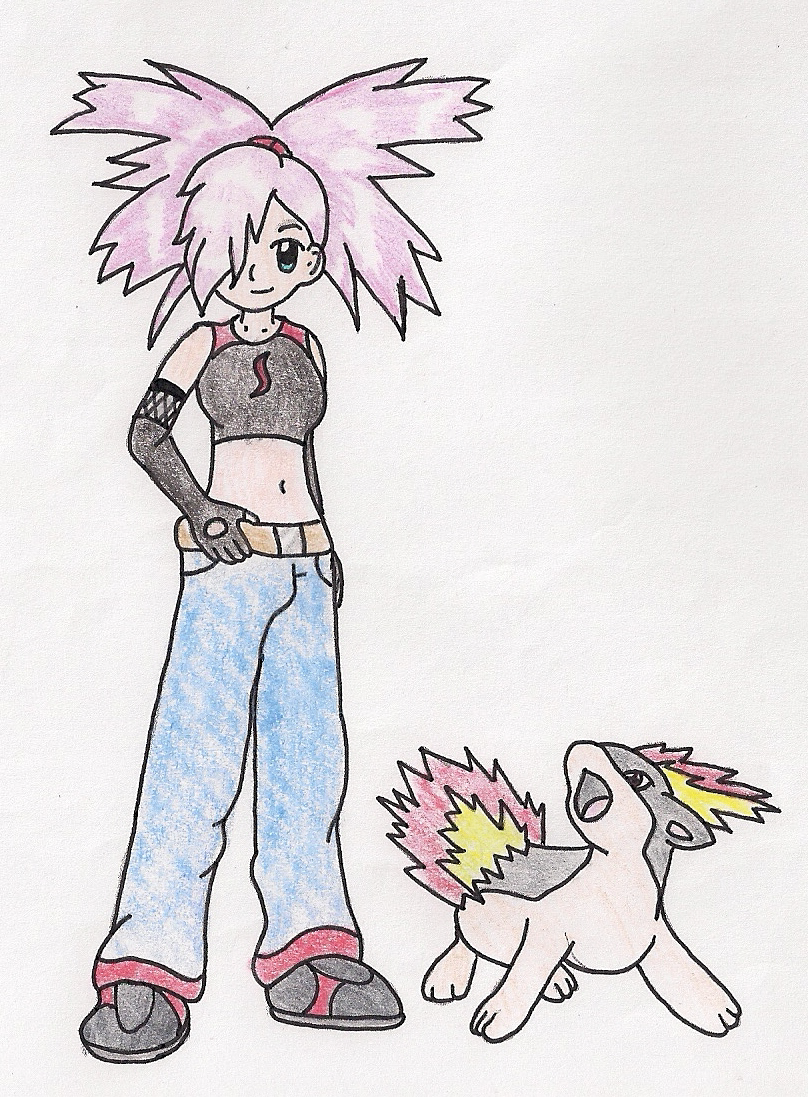
Next up is the flak my OC (original character) Pyro gets from time to time. She's not a clone of Flannery, the Fire Gym Leader from Pokemon Ruby, Sapphire, & Emerald. So what if I "copied" her hair so to speak. There's a story behind it, that fits, but does anyone read comments?! No that would be too much work. Anywho, I've revamped her so she doesn't look this way anymore because I felt like I was feeling like Pryo got less of my love than my other characters.


Keep in mind, this one is really old. I was young and inexperience at creating character for series when I first created, Kimiko Haruno, and well she wasn't much but a "twin" cousin of Sakura Haruno. I didn't even know how to put her into the story of Naruto. And this little couple picture of Rock Lee and Kimiko was the start of all the hostility of the Sakura look-a-like. Eventually, she got her own style, story, and personally, but she was never Sakura. Kimiko was always Kimiko who might have looked like her cousin.
And now this is what Kimiko looks like with how Rock Lee looks in my universe. Very different from her cousin and in her alternative universe version of the Naruto plotline based around the role playing I did with her and the actual story.
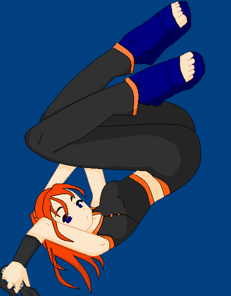
Another prime example of pose stealing blaming is this lovely picture of Kimiko and Lee shedding tears for the fallen:
Who in there right mind think that I copied this pose?! How do couple consult each other over sadness? Not in this "copyrighted" pose that's for sure. 

-Lastly we have the topic of what are called bases and screenshot editing. Bases are pixel dolls of existing art that can be edited by other people via drawing over or "clothing" them in a digital drawing program. I have even tried them out back when I wanted to do digital art, but was limited to MS Paint. Yeah, it wasn't pretty back then, but it did help me grow as an artist with it.
I'll admit to bashing screenshot edits, but I do hold a higher standard of art than most of what I have seen of these on photobucket. First off I have no problem with bases as a tool to help with poses,  anatomy, or clothing. And well, my first impression with screenshot edits were not the good. I know I wasn't good at creating my own characters, but there comes a point of being stubbornly lazy. If you use a schreenshot at least give credit where it's due for the original and try to make the character look different. Like this screenshot collab I did:

 I bet you couldn't even tell what the original characters, looked like. Did you know that this was a screenshot of  Lucy and Juvia from FairyTail. I even added my Exceed (cat), Azure, to the picture.

Last thoughts are on all of this you can't reference is this is this if I can't reference poses then what about these: 
Well they might be similar yet different, I don't claim the original I only used it as a reference. References are tools that help you improve, and as long as you have the desire to progress then go forward! And always be yourself no matter what.

-FoxCat ya later

Being a Christian Mangaka

Konichiwa. Today I wanted to talk about me, a Christian Mangaka (manga artist), and the challenges my style of art has. First off I want to start with a few Japanese terms that are big no's in my book:

Hentai: Literal Japanese translation is "pervert". In anime/manga this is basically animated porn. It's characterized by overtly sexualized characters, sexually explicit images, and plot. Anything can go, and here is usually some form of unrealistic body parts usually sexual parts.
    As a Christian I absolutely refuse to touch this stuff! Unfortunately it's everywhere and sometimes I can't even search certain characters without coming across a bucket load of these in just a simple google search. Man that right there just reminds me how dark and fallen the world is.

Ecchi: Literal Japanese translation is "sex". Ecchi is basically a step below hentai. It's characterized by softer notes of sexual themes. It's erotic, but not all out sex or anything vulgar, this can include panty shots, the occasional nipple, sexual humor, and other forms of fan services that doesn't actually contain sex.
    That makes it sound not that bad however Ecchi is a form of fan service for sex, which in my mind is porn. You can't hide what it is by just not showing the actual act, if it leads to some sort of sexual arousal then call it what it is porn. Being in the world I know that there are levels of porn, I would put Ecchi is a man looking at a playboy magazine and Hentai is watching a porn video. Again I can't look through anime/manga style pictures without coming across a bucket load of these images in a simple google search.

Yuri: Explicit Lesbian relationships
Yaoi: Explicit Homosexual relationships.
    These two go hand in hand as they both refer to same sex relationships. As an artist I absolutely refuse to draw either one of these because it goes against the truth of the Bible, which calls it a sin plain and simple. Both Yaoi and Yuri are becoming more apparent with the rise of the same sex relationships in the US, and I personally don't like it.

Uke: This is a sex term in Yaoi that goes along with Seme, these two refer to position in sex. This can also depict a type of male character that is younger, shorter, sweeter looking. These male characters are often very feminine looking. Uke characters can be a Japanese version of a Metrosexual.
    Gosh, this one is a hard one to define because it usually refers to Yaoi sex, yet I have found its other definition.  I dislike this so much...If you are going to make a male, make them masculine! If they end up looking feminine then give it some hip shape and some form of a chest, or at least say "she's" flat chested! I know we, in America, have a term for this too however it's doesn't usually go with a homosexual relationship. I understand making a character Uke and then giving them a female companion that's what we call a Metro here in America, but that is not the norm for Uke characters.

Next are a few challenges that may or may not have an actual term:

Genetic Sexual Attraction: This the correct term for having a sexual attraction to someone you are related to.
    I don't have a problem with this in certain cases like Luke and Leia's attraction to each other in Star Wars before they fully knew they were brother and sister. What I have a problem is "shipping" (making a couple) siblings together when they know they are siblings from the beginning! Hello, that isn't healthy and just gross! I'm sort of okay with cousin's being paired together, for similar to the norm of when this type of attraction is the not knowing of each other. Pure and simple the modern culture of the world I live it frowns upon this, and I have the same feelings about it.

-Nudity is a big challenge within anime/manga art. Let's face it female warriors in most fantasy video games means no armor basically. As seen here in a picture of a Skyrim female warrior:

Okay so if I'm fighting other warriors, monsters, or dragons why is my character going to have most of her torso exposed? There is no rhyme or reason for this other than sex, let's have our females be a sex fan service to all the lonely males playing our game. Even some female warrior characters have this problem, like Erza Scarlet from FairyTail.


 Another point of nudity is in the form of magical transformations. Almost every magical girl anime has transformations that have a form of nudity with a costume change, even Erza (pictured above) falls into this.

While I find nothing wrong with the way they do this, it has been viewed as a form of fan service. I have watched a few anime series that have this as depicted above: Sailor Moon, Fairy Tail, Tokyo Mew Mew, Digimon Tamers, & Digimon Frontier. With these I find the person who gets sexually aroused by them sick, and find nothing wrong with the way they depict transformation because it's showing a more of a silhouette.
    Bottom line with nudity, I draw for me not to be a service to people's sexual needs. If I want to show something I cover up parts as I did with this:


 I do want to note with this drawing the two characters are married and that is the only way I will draw couples with some nudity, but overall I refuse to draw nudity due to the fact that it leads to sexual arousal in some humans.


-Next is the "top heavy twigs" or the large boobs. I have watched/read some series with these character and while I know there are woman out there with larger boobs and the ideal body with them, *cough* American models *cough*, I know they are not the average. Example of these characters would be Lucy from FairyTail, Orihime and Rangiku from Bleach, and Blair from Soul Eater. I don't have too much of a problem with these characters since this is a part of Japanese anime. Though as with everything there comes a point where it becomes too much and purely ridiculous:


This is a prime example of a "what in the right mind is this?!" with the plump chest. Sadly this style is well loved by some.
Now think of a more reasonable larger size, add a thin flat belly, a very accentuated hourglass hips, maybe a larger than needed behind, pencil legs & arms and you've got what I call a top heavy twig. Bottom line these are the animated versions of American Models, actresses, and Pop stars.


Overall I rather have more realistic bodied characters than have something that can come across as a hooker. Normal females are extra large in the chest, small in the waist, and large in the behind without having something done to them or have a ton of problems.  Truth be told, the large chest naturally goes with a larger woman. "Angels" as some companies call them do not exist in real life without blemishes that might be internal rather than external. 


-Violence and blood are another challenge. We have here in America what is called cut anime, this is where they edit the Japanese versions to conform them to American standards. This includes many to have less violence or blood in order to match with the standards for the demographics of the targeted audience. This can be a challenge in drawing as to have PG-13 art. I want my art to be free of "mature content" filters. You can show both in a moderation just like movies can as I have done with this piece:

  My next venture might be into the mind of an introvert artist. Till then....
-FoxCat ya later.

Monday, February 22, 2016

What to Color With overview: Paints and Other Tools

Finally the last part of my overview before I start on my review of what medias I have.

Tempera and Poster Paint: Anybody who ever did a painting project in elementary school knows what these are. Both are non-toxic and water-soluble. They're more vibrant and opaque than watercolors, but are transparent compared to acrylic paints. These paints also have a limited selection of colors, and are usually made with cheap pigments so mixing colors aren't an exact science like you think it should be. And they only really work well on paper media, but can be used for more.

Watercolor Paint: Again most people have used watercolors as a kid. Cheaper watercolors can be easy to clean up, and you can even find washable watercolors for younger painters. For coloring/painting, it can be had to control the paint and depth of the color, so practice and experimentation is needed. You'll also need to use watercolor paper or heavy weight paper.

Acrylic Paint: There are two kinds of acrylics: craft and artist. Craft acrylic paint usually comes in bottles and can be quite cheap in price, while artist acrylic paint comes in tubes and are average in price. Generally speaking craft acrylics can be used in good quality on a range of media from paper to ceramics, while artist acrylics are better for canvas or heavy weight paper. Acrylic pain is plastic base therefore it's permanent, but it can scratch off of some surfaces over time. So it's a good idea to spray those surfaces with a sealer, porcelain sealer is what I usually use in a matte finish but you can use a glossy finish.

Oil Paint: Oil paints are well liked with some for their vibrant colors, textures that can be created, blending abilities, and a slow dry time that allows for slow work. However, that slow dry time makes it temperamental, and usually you want to put a varnish over them. Plus, clean-up is a pain due to the fact that you have to use solvents on the brushes, skin, etc.

Blending Tools: There are a few different one you can buy including colorless blending pencils, colorless blending markers, cheese cloth, and and blending stumps (or paper stumps). Kneading erasers are also a blending tool as well as an eraser. You can use fingers, cloth, paper, and/or tissues as well. It just depends what you like by testing them out. I personally use stumps and kneading erasers when working with drawing pencils, charcoal, and pastels. And I use colorless blending pencils for my color pencils to blend colors together or to get a smoother color.

Erasers: Not all erasers are created equal. there are quite a few from the typical pink rubber erasers we all used in elementary school to grey kneading eraser. You have rubber, art gum, kneading, and vinyl eraser. Rubber can also be found in a sharp-able pencil as well as the big pink shape we all know and love to flip on the table. And Vinyl can be found similar to rubber pencil erasers in the form or a click eraser which are like pens. I generally use vinyl erasers in both block and click form for my drawing. I personally don't like art gum erasers, yet they're great for getting pencil off of ceramics. Also kneading erasers don't play well with others in certain weather, so be careful with them.

Pencil Sharpeners: Like erasers, these are not all created equal. And honestly it depends on what you like, it's a matter of testing them out. Some materials do require their own type of sharpeners such as you need to use sandpaper though you can use pencil sharpeners but you risk messing up either one, and crayons need their own sharpener. If you're lucky Crayola might still be putting crayon sharpeners on the back of the boxes of their larger box sets. Just remember when sharpening pencils that isn't always the sharpener's fault sometimes it can be a faulty pencil. For example, most of the time you are just coming up to the cracked lead, soft leaded pencils are known for this, and sometimes a big chunk of wood breaks off this could be caused by a snag in the wood, or using the wrong technique for the sharpener.

Fixatives: There are two main fixatives for charcoal, pastel, and pencil medias: workable and final. Workable is designed with pastel, chalk, and charcoal in mind. This makes what you have permanent to the paper but still pliable so you can blend, shade, and erase it without losing too much. Final is fully permanent, so you shouldn't be able to work with anything sprayed with it. I use a final fixative on my drawings, which helps me work in stages when I'm working with smeary colors. You can also use hairspray as a cheap alternative, just be aware that some can cause paper to wrinkle and/or cause it to turn yellow.

And now it's time for reviewing.
-FoxCat ya later

What to Color With overview: Markers, Charcoal, and Pastels

Not much to say for an intro here other than, I didn't want to do a huge post so here's the next section:

Chalk: Almost everyone has used a form of chalk in their life, via school white chalk on a chalkboard or sidewalk chalk on the driveway. On paper they're not permanent so they need to be sealed to the paper. And they can create a bunch of dust which can mess up your work if you're not careful, it's nice to have something on hand to remove the dust with and yes you can blow it away.

Pastels (Soft): These are a lot like chalk. They can be hard to work with because the color doesn't become permanent, so you need to spray them with a fixative (I'll explain more on this produce later). Soft pastels are easy to blend, but do tend to smudge. Like chalk, they do create a lot of dust, so you want to either be working on a surface that can be cleaned easy if you wish to blow off the dust (I don't recommend this due to spit), or find something like a cloth or brush to dust the away. Blending can be done with a number of things: fingers, cloths, brushes, tissues, kneading erasers, and blending stumps (stumps). You can even paint with them using a water brush (a brush that holds water in the handle) and thinking along the lines of watercolors. Quality and hardness depends, generally speaking the softest and best quality come with a hefty price.

Pastels (Oil): These pastels are more like crayons than chalk. They're creamy (usually) and apply a thick rough color. Oil pastels are easy to blend with fingers, stumps (though might cause scrapping), cotton swabs, cloths, and tissues (might stick to them). They don't have a fine tip, and cannot be use easily for fine details. You can sharpen them by shaving them to some sort  of a point with a razor blade, exact-o knife, or a sharp knife. Remember to always be careful when using sharp objects, otherwise you might be coloring with blood and waiting around at the doctor's office! Overall oil pastels are good for larger areas, and are nice for blending colors together.

Charcoal (Vine): These are long thin pieces of charcoal the resemble sticks. Vine charcoal is similar to soft pastels and chalk in that's not permanent, needs to be sealed, east to blend, tends to smudge, and creates dust. It's also good for sketching as well. Blending can be done with the same materials as soft pastels.

Charcoal (Stick): These are made from charcoal that has been compressed into a small block or cylinder. They're harder than vine charcoal making them not as easy to work with Variation on intensity depends on pressure rather than how much is there. Blending can be achieved the same way as vine charcoal.

Markers (Water-Soluble): These markers are the average non-toxic ones that are usually washable in some form. They don't have permanent ink, and don't tend to bleed through paper quite as badly as other markers. Water-soluble markers can go on wetter which can cause a small amount of smearing. There are some high quality ones available for scrapbooking, but you will be paying more for them.

Markers (Alcohol & Solvent Base): These markers provide excellent, smooth coverage, and vibrant colors, which makes the a pick for most artists. They have permanent dye-based ink, and many are good quality. They can blended to a point, with a colorless blending marker, but this isn't as easy as blending color pencils. They do have an odor to them, some stronger than others, and can bleed through lighter paper and outwards too.

Markers (all): Generally, all markers are translucent to a point, and can be layered for cool effects. A few different adult coloring books even show using markers to do shading on color pencils, blending color pencil colors with different color markers, and/or making color pencils more vibrant by coloring over them with the same color of marker.

Marker Tip Lingo: Pencils can be sharpened to a fine point for details & sharp color or left blunt for larger areas & softer color. Markers however can't be, so they come in a variety of tip styles and sizes:
Chisel: This tip is like a rectangle cut on an angle. While you can get a finer line by suing the edge of the chisel, they're usually used for filling larger areas. You won't be able to color really find details with this tip.
Broad: A felt-tip that's round, somewhat tapered shape. It's not as tapered and as fine as with a fine tip, which makes them great for filling large areas. These tips are often paired with fine tips in double ended markers.
Bullet: A fine, but not ultra-fine, tip shaped like a bullet. You can get pretty detailed with these however they're not ideal for filling in lager areas.
Brush: These are a soft, flexible, tapered tip that looks like a paintbrush. These tips can be use to produce fine details or create broader strokes depending on how you angle them and the pressure applied. They're pretty versatile.
Fine or Ultra-Fine: These are the smallest out of all of the tips. Sizes are usually measured in millimeters from 0.05 to around 0.8. These tips are best reserved for drawing, outlining, and fine detail work.

Next will be paints and other tools.
-FoxCat ya later

What to Color With overview: Pens & Pencils

Alright so there's these books called Adult Coloring Books. And you impulsively bought one, but now you are unsure on what to use to color it in with.
    Okay well that might not be you, yet I'm asked ever so often "what do you use to color your art?" I can always rattle off what I use, but there is so much you can use. Since I did a review on some coloring pages, I thought I would go through with my own adult coloring book and review the utensils that I have. And to start off I put together a list of almost everything you can use to color with. I know the title says pens and pencils, but I thought we better start of with the classic coloring utensil first.

Crayons: Who hasn't colored with these as a kid? I've found out that with a new crayon you can do some form of shading, however they're a little blotchy overall.
Twistables: This is a type of crayon created by Crayola for older kids and adults as a more sophisticated crayon, something in between a regular crayon and a color pencil. Other companies have versions of the twistables too.

Color Pencils: My preferred utensil for coloring. Color pencils are versatile for both fine detail (not super fine) and large areas. Shading is easy with two different ways to do it, darkening a single color or blending various hues of a color. Blending two color together is easy depending on the hardness of the lead and what you are using to blend with. And outside of erasable ones, color pencils can be erased to a point, this can be helpful in doing more complex highlighting. There are a number of colors, including neon and metallic color pencils.
Woodless: You can get woodless ones that are just the colored graphite.
Twistables: Along with twistable crayons, Crayola has twistable color pencils, or their version of woodless.

Watercolor Pencils: These are special color pencils designed to mimic the effects of watercolor paint. Watercolor pencils can be used like a regular color pencil however they do tend to smear. there are a few different ways to use the watercolor effect: you can apply water with a brush to float the color on the paper turning it into a watercolor painting, you can also wet the pencil first and apply it wet, or even touch a wet brush to the tip and paint like normal watercolor paint. Using the watercolor effect does require heavier paper because lightweight paper will wrinkle up and some inks can run when wet.

Drawing Pencils: These are the pencils designed for drawing or drafting. Everyone has used one of these in the form of a #2 pencil, which happens to be the middle range drawing pencil more commonly known as a HB pencil. Drawing pencils come in two types H (hard) and B (black). The range of drawing pencils is 9H-9B though most artist star somewhat in the middle of the range (I personally have a liking for a range of HB-8B). Normally, for coloring, or rather shading, you would want to stay more with B pencils since they are darker and easier to blend with. Blending can be done with fingers, blending stumps, cloth, and tissue.
Woodless: Just like coloring pencils, you can find woodless versions of drawing pencils that are just graphite.

Ball Point Pens: These are the everyday pens, which do come in a variety of colors. They can be ultimately used to color with however I don't recommend coloring much more that small fine details with them or outlining.

Gel Pens: Ah, the art supply to collect back in the 90's. So these unique devices have a ball point, like a regular pen, with non-toxic, ecofriendly gel ink. The ink is permanent on paper and washes off of skin. They may or may not wash out of clothing. Gel Pens give an even coverage, vibrant color, smoothness, and don't bleed through the paper. However the ink applies fairly wet, so it takes longer to dry, and makes it susceptible to smudging. These pens have become greatly available again due to the use of them in scrapbooking, so there's a large amount of variation to pick from including: neon, pearl, glitter, metallic, and glow in the dark.

Marker Pens: Okay these are a unique combination of a marker and a pen. These can often cover permanent markers, highlighters, and bush markers. I usually use this term for illustration markers, or pens. Marker Pens are usually fin tip, but can be chisel or bush tip. Tip sizes are usually measured in millimeters, from 0.05 to 0.8. They can come in a variety of colors, and work well for small details and outlining. I usually use a black 0.1 or 0.3 pen for inking my drawings.

Alright that's enough for tonight, next up is markers and chalk-like medias.
-Till then, FoxCat ya later.

Friday, February 19, 2016

Adult Coloring Review part 2

Konichiwa, it's time for the next part of my Adult Coloring Review. Now this a review of what I have colored myself via Barnes and Nobles' All-American Art Unwind day. And At the end will be my assessment of my thoughts on this fad.

Colored with Prismacolor Premier Double Ended markers, Crayola color pencils, and Sargent Art color pencils. 
       This one is from Lost Ocean by Johanna Basford. I tried to on this one to mix medias of marker and color pencils, and well as I pointed out in part one "I do not recommend color pencils for these..." The border was fun to do, but when I started the sand castle in color pencils I lost my groove for coloring it. I was becoming frustrated and was not relaxing and enjoying myself with the small details of the center. As you can see I didn't bother finishing it for that very reason. Relaxation factor: Below Average. Markers are good for the border, but I recommend gel pens, fine tip art markers, or fine tip permanent markers. Unless you are okay with your coloring skills on these with color pencils (which I'm not).


Colored using Prismacolor Premier Fine Line Markers (0.5), Staedtler Triplus Finliner (0.3) 10 count minus 2 marker pens, and Staedtler Lumocolor permanent (F 0.6) 8 count minus 1 marker pens.
     Owl design from Millie Marrota's Tropical World book. Another one of my favorites. I found this one to be very relaxing since I started coloring it. A pretty simple design with not too much going on. Again the only problem with it was not the page itself but my coloring devices.

 Colored with Prismacolor Premier Double Ended markers.
        Okay, this one is another prime example of Not Relaxing! From Animorhia by Kerby Rosanes. First off I love animals and thought this one might be fun, but with all of whatever is happening after the wild dog's head is beyond me. I did try to color it but got lost in the rhyme or reason behind the random things. It's easy to get lost in the mess of junk, and I couldn't figure out where things and fur were. Overall not fun by any means, seriously what does fish, worms, waves, a pencil, light bulb, doll, purse, cheese, etc. have to do with a wild dog? Relaxation factor: Low, Very Low. Who would find sorting out all the gunk going on here relaxing? I don't.


Colored with Prismacolor Premier Double Ended markers and American Crafts Metallic Marker (Gold and Silver).
          Dragon image from The Official A Game of Thrones Coloring Book. First off I was looking forward to coloring this one because I love painting dragons! And it didn't disappoint me. A fairly simple design of a trio of dragons and mountains. The smallest of the three was a little bit of a pain to color. Relaxation factor: Very High. Just to note, this could/can change depending on how you color it. I went for a very basic coloring rather than coloring the dragons more complexly via multiple colors on the main body. I did add some gold to the mountains in the front and did silver on the dragon claws, just to be different. 
 Started coloring with Prismacolor Premier Double Ended Markers.
      From Harry Potter Coloring Book. Gosh, where do I start with this one the background on this is from hell itself! Okay well not really, but still I stopped coloring this for fear of needing a straight jacket if I continued and tried to finish. As for the owl, snowy owls are my favorite type of owl and this one looks like one so therefore there is very little color needed. And the forest repeating pattern background is too busy, too much, and too small. Relaxation factor: So Low it need to be burned in the Earth's core. I only recommend this one if you have a ton of free time and are so bored that watching paint dry sounds fun and have a ton of fine tip coloring devices! Man, I might be throwing it away after this just to get it out of my sight. My eyes start crossing and I get a twitch from looking at it. Next please!


 Colored with Prismacolor Premier Double Ended markers and Sergeant Art Brush markers.
        Captain America from Marvel's Color Your Own: Age of Ultron. *Insert Fangirl giggles here* Okay needless to say I'm a fan of Cap both on the big screen and on paper, and my markers did him justice. Alright fangirl aside, the Relaxation Factor: High. I only put it high because not everyone likes comic books and find them childish (that's so not the case but that's for another blog). With that out, this one is very rewarding considering the fact that shading is already covered on Captain American, so all you have to do is color him and he looks great in the glory of being beat up with a broken shield. And the background is pretty easy to color too, again shading is already covered.

 Started coloring with color pencils. 
           Artwork from Vive Le Color! Butterflies. You know what I typed/said about the Harry Potter page? Yeah well ditto that for these butterflies of demonic small design. As you can tell with the one butterfly's colored body that even a fully sharpened pencil couldn't do any justice to the details of the page. Relaxation factor: So Low it need to be burned in the Earth's core. I only recommend this one if you have a ton of free time and are so bored that watching paint dry sounds fun and have a ton of fine tip coloring devices! Or you could scan it into the computer and pick a single butterfly and blow it up to save your mind.

     Overall I would say take your time picking out what you want to color, look into all factors. Helpful factors are: Picture subject, details, and coloring devices. 
1. Picture Subject
      Always pick something you enjoy in real life otherwise it won't relax you. For example, my favorites included subjects of books, animals, and superheroes. Look at what's out there and don't pick up the first book you come across that might be a negative note onto your health with it. There are a ton of these everywhere! You can find them at these places: Art Stores (Michael's, Jo-Ann's, Hobby Lobby), Barnes and Noble, Target, and I've even seen some at Walmart. Shameless plug here: find someone with a Barnes and Noble membership for 10% off the coloring books there, and you can get 40-50% off cupons for the art stores I listed out of the Sunday paper ads and online off of their websites (these will make a difference since most of these books are 15+ dollars).
2. Details
       Flip through the book of choice before buying! If you see more that three designs that don't look good to you via too much small details, too busy, etc. Put it down! Find another book with similar subject choice. Remember these Adult Coloring Books are suppose to be relaxing. And if you are like me small details and too busy details are not relaxing and in fact are just the opposite.  
3. Coloring Devices or Utensils
     I recommend testing various coloring tools out, you never know what you're going to like. I for one have many to choose from since I'm in fact an artist and have enough for a small store. There are many to choose from: Color Pencils, Markers, Gel Pens, Permanent Markers, Art Pens, Pastels, Paint, Charcoal, Ink, Pencils, Pens, Crayons, etc. Test them out on the pages you don't like or find a cheap on to use as a tester book (Target has some for 5 bucks). I would do a tester book because markers and permanent markers can bleed as can ink. Or you can always scan them into your computer and print out any you want to do and have a clean blank book, though I might do this only for the designs that I want to color more than once because that's a lot of ink to use just to have something relaxing to do.

-Till next time, FoxCat ya later. 
 PS I apologize if it's hard to read, that was not my fault it's something going on with blogger.

Saturday, February 13, 2016

Adult Coloring Review part 1

Konichwa,
       This Life post is about review the new phenomenon, the Adult Coloring pages/books.  First off here are some benefits that the scientist say Adult coloring has:
1. Non-drug "perception" for stress in the form of relaxation.
2.  Help with a number of emotional and mental health issues such as: obsessive-compulsive disorder, anxiety, stress disorders, depression, eating & binge eating disorders, anger management issues, and substance abuse issues (just to name a few).
3. Strengthens focus, problem solving, and motor skills
4. Promotes positive vibes
5. Coloring utilizes both sides of the brain, right and left.
6. Therapeutic
7. Bring back nonchalant memories of Childhood

    Now this a review of what I have colored myself via Barnes and Nobles' All-American Art Unwind day. Now as an artist I view things like these coloring pages as a good thing to challenge myself in various ways such as limiting myself to one set of coloring utensils.

Okay this was the featured coloring page of the event. I had fun with this one limiting myself to just my Prismacolor Verithin color pencils (36 count)
    I felt this parrot design had just the right amount of detail in order to be a challenge, but not so much that it became a "pain in the butt" to finish. Relaxation factor: High. I found it pretty relaxing being the first one I've done.

 Colored using Sargent Art Brush Markers, Prismacolor Premier Fine Line Markers (0.5), Staedtler Triplus Finliner (0.3) 10 count minus 2 marker pens, and Staedtler Lumocolor permanent (F 0.6) 8 count minus 1 marker pens. 
      This Live a Posh Life! page is very whimsical design, I personally love the flowers and the smaller butterfly on this page. However I found the larger butterfly a little odd, and what's up with the bird on this page? It just looks out of place since it is the only one on the entire page! It would be okay if there was a part of another bird or a smaller bird somewhere else, but it just looks like "well we didn't want another large butterfly, so let's paste a big fat bird there since we have too many flowers." Okay....personally I would have add another large butterfly or another heart there or a ladybug because we have one cut off by the top of the page, and it looks more in place than that bird. Alright enough about that, relaxation factor on this page: I give it a high score here. Besides that bird, the overall design was very fun and relaxing to color.


 Colored with Prismacolor Premier Double Ended markers (various colors).
    Another Life a Posh Life page, this book design was fun and relaxing. First off I want to say I connected with this design with my liking of reading. The overall design is simple and repetitive without being to much. With this design, you could easily color one style of books altogether and then go on to another set. Or you can do it like I did and keep most of the books colored the same way only changing only a few things here or there. Relaxation factor: Very High! The simplistic design made this one very relaxing to color, almost mind numbing if you will. I was able to forget about my day while coloring this one at night sitting next to my husband watching Netflix. I even colored the background on it! And I'm not one for enjoying backgrounds.

 
Colored with Staedtler Triplus Finliner (0.3) 10 count minus 2 marker pens, Staedtler Lumocolor permanent (F 0.6) 8 count minus 1 marker pens, and Prismacolor Premier Double Ended markers (various colors).
    Peacock design from Millie Marrota's Tropical World book. This one has been my top favorite page so far. It's very simple as just a Peacock! No super complex patterns, no whimsical note here, just a simple illustration of the bird. It was very relaxing and easy to color. the only problem wasn't even because of the page, it was my coloring devices.

Colored using Sargent Art Brush Markers, Prismacolor Premier Fine Line Markers (0.5), Staedtler Triplus Finliner (0.3) 10 count minus 2 marker pens, Staedtler Lumocolor permanent (F 0.6) 8 count minus 1 marker pens, and Prismacolor Premier Double Ended markers.
       Large Cat design from Millie Marrota's Tropical World book. I found this one okay. A bit of a challenge and not too messy of a design. I found the mosaic pattern of the cat to be a little overwhelming, yet what I did made it more manageable. So I put this one in the middle depending on how you decide to color it. Relaxation factor: average.

Colored using Prismacolor Premier Fine Line Markers (0.5), Staedtler Triplus Finliner (0.3) 10 count minus 2 marker pens, and Staedtler Lumocolor permanent (F 0.6) 8 count minus 1 marker pens.
        Pineapple design from Millie Marrota's Tropical World book. I liked this one not too tedious, only downside was I was coloring this one while trying to get over sickness and allergies, which is why the pineapple top is so colorful. Relaxation factor: hard to rate do to coloring opportunities. Overall I think this is a good coloring page. It lends itself well to media tools such as fine tip markers, marker pens, permanent markers, and gel pens.

One Final Note: Overall I do not recommend color pencils for these if you are much more than a novice at the art of coloring. I found with a few of them that I either did use them on or started with them, that I became very frustrated due to the small details where I felt like I was going to sharpen the pencil down to nothing in order to get sharp color and clean color in. Prismacolor markers and the Steadtle Lumocolor marker pens tend to bleed out a bit. And the Prismacolor markers can also bleed through the page, which is a problem I had with the peacock page which has the pineapple design on the back of it and similar with the big cat's nose.

And with that concludes my first part of this review of my journey into the realm of Adult Coloring. Till part 2- FoxCat ya later

Sunday, February 7, 2016

Mindless Thoughts

Random thoughts of my Art at the moment:

1. Current project: Food Challenge. Revamping is in progress....So far I have 10 done, one inked waiting for coloring, and one ready for inking. Currently this is the latest finished one:

 2. Thoughts of Art for money......Selling my art might not be something that I'm not new at. My hand-painted Dragons used to go like "hotcakes" in my mom's ceramic studio and the various art shows/fairs we would attend. As a volunteer at the Lighthouse for the Blind, where my mother teaches Ceramics, I got to participate in their craft sale. And I have done a total of about 6 commissions (drawing) in my time as an Anime Artist. Plus, a few commissioned Dragons. So, with the personality that I have, it's hard to be the one stepping out on my own to find through trial and error how to go about selling my art. I have done a few art shows/fairs on my own with the help of my husband (who was just my boyfriend at the time) or with a few of my art buddies' from college. And to constantly hear from people "Oh my Blank does this kind of drawings too." and feel free to fill in that blank with whatever you can think of (son, daughter, grandchild, niece, nephew, cousin, etc.), "Have you considered going into Animation/Comic book company/Publishing books with this?" do you know how hard it is to get into those type of things?! seriously thanks but no thanks, I couldn't handle the pressure and I don't really have the skills required for any of those jobs you just listed people. I barely have one panel page (comic book style page) under my belt and it's not anywhere near a DC or Marvel upcoming title, or "Why aren't you at ComicCon selling this stuff?" Oh geez where do I start with this one, maybe because I don't have  1,200+ dollars to spend on a space in their artist alley area space that's if I manage to get picked out of the thousand plus applications they get on top of that I would still need the money to get my "badge" or ticket to said convention. It's not like that's not on my artist bucket list. Any hobby, needs money that's why I'm here not at ComicCon, Anime Expo (AX), or WonderCon.
     It's been a few years since I started up my own Facebook page, Digifoxcat, and I'll admit to have forgotten about it since I'm posting my artwork on my personal page and on deviantART. On both deviantART and Facebook, I started up commissions. And over time with no responses, I became very depressed in the realm of selling my art. I have been encouraged by my husband and by God to regain my courage and start to slowly peruse selling my art once again. Baby steps are a small key in an introverted artist's journey to regain self worth in her passion. I got the idea that a challenge would help keep a daily/weekly/monthly regiment of drawing going, so that started my first thought. Next, is to work on organizing my artworks in order to update my portfolios, both online and my "hard copy" one, in order to pick a portfolio review at this year's WonderCon to hopefully get to see what the "Pros" think of my stuff. And to look into what's it going to take to sell my art via craft/art shows and fair type things.

-Till next time, FoxCat ya later